Colour Me Inspired: How Artists and Curators Are Moving Beyond the White Cube
Although white walls have dominated our contemporary art viewing experience, the use of colours have been making a comeback.

W hen you look at a painting, do you notice the wall behind it? Or is the colour anonymous, like a stage-hand dressed in black? When museums were in their infancy, the aim was to grant artistic access to the many rather than the few. As such, the hanging of paintings in early public museums in the 19th century was a vastly different proposition to now. Artworks were closely bunched together, stacked one on top of each other to make full use of the walls, looking to modern eyes like a jigsaw puzzle and reminiscent of a warehouse. It is doubtful in most cases whether colour could be seen at all, as frames bumped into each other on a crowded surface. There is a flawless logic to this efficient use of space, and London’s Royal Academy keeps up the tradition in its annual Summer Exhibition, with the aim of giving wall space to as many new artists as possible. Then came the white cube aesthetic, for which New York’s Museum of Modern Art is widely credited for in the early 20th century, although it was already in practice a century before. White walls became the dominant curatorial choice for institutions and museums in response to the needs of modern art. With the rise of abstraction in art, artists from groups such as Bauhaus and De Stijl sought to exhibit their works on white walls to remove all possible distraction. Nonetheless it was not until 1976 that the term “white cube” was coined in artist and critic Brian O’Doherty’s three-part Artforum essay, subsequently setting art world scholarship ablaze. Over more recent years, however, the consensus has emerged that space and distance are conducive to appreciating art, and equally so, the stark white wall became all but sterile and lacking, thus asserting the importance of the choice of a predominant, now visible, background colour.
The Colour Debate From Whistler’s White Cube to Isaac Newton
Visitors to galleries and museums have long become accustomed to stepping into a space of freshly painted white walls, a snowy igloo studded with sparsely framed paintings. This is a rubric observed in museums ranging from Hong Kong’s new M+ to Damien Hirst’s Newport Gallery in London, and the Solomon R. Guggenheim in New York (this last one is white on the outside as well as the inside). In 1883, James McNeill Whistler’s show Arrangement in White and Yellow at the Fine Art Society in London has been cited as the first such “white cube” show. An artist for whom colour took equal billing with subject matter, his pairing of dazzling white walls and white-hued paintings heralded the dawn of bright, clean lines and an immaculate, pared-back aesthetic. The fuse was lit – in the early 20th century, artists of de Stijl were to insist on white walls as the only way to show their new geometric abstractions.
Whistler’s show was at an apex of more than a century of lively debate on the effect and rules of colour. Johann Wolfgang von Goethe had published Zur Farbenlehre (1810) partly to rebut Isaac Newton’s Seven Colour Theory (c.1665). Scientific debate inevitably led to artists competing against each other to prove their own theories of colour – on canvas.

Artists Setting The Ambience Within Painting
Experimenting with background colours was a preoccupation for artists of Whistler’s time. The impact of choosing one wall colour over another within a painting is a palpable theme. In 1888, Vincent van Gogh painted a series of seven paintings, known as Sunflowers, to welcome the visit of his friend, the artist Paul Gauguin. If we compare the Sunflowers in Munich’s Neue Pinakothek with that in Tokyo’s SOMP Museum of Art, the colours of the flowers and vase in each is nearly identical, but the background of the wall has been fundamentally changed. In the Munich version, van Gogh has painted a wall which is resplendent, pure, powder blue, allowing the sunflowers centre stage, bursting forth with vitality; in Tokyo (similar to the versions in London and Amsterdam), the sunflowers merge into a generally yellow colour scheme which suggest nature, zesty freshness, a oneness with the sunny south of France. In his colour theory, Goethe had described how yellow is the closest colour to the light, and these sunflowers appear perpetually bathed in it. The messages are not opposed, but the impressions created by each are subtly different. While van Gogh used the concept within painting, the same can be applied for wall colour setting the ambience for display.

Wall Furnishings Accent The Grandeur In Art
Just as van Gogh created a welcoming environment for his friend, art is often intended for the home. Most people’s homes are not pure white cubes and its interior wall furnishings influence the grandeur we see in the art hung. One historic example is a case in point: Sir Robert Walpole, Britain’s first prime minister, assembled a noteworthy collection at his country seat at Houghton Hall in Norfolk. After his death, it was mostly acquired by Russia’s Catherine the Great, forming the basis of the Hermitage Museum’s collection in St. Petersburg. The return loan in 2013 to Houghton Hall saw the artworks reunited with ceiling paintings by William Kent, white and gold fireplaces, green velvet and gilt furnishings. Titled Houghton Revisited, the exhibition won the Hudson Heritage Award for Best Event and Apollo Magazine’s Exhibition of the Year award. As Candida Höfer’s sumptuous photographs attest, the Hermitage – housed in the 18th century splendour of the Romanov Winter Palace– is itself no monument to white cubed precepts. This is a collection, therefore, which, despite many homes, has perennially absented itself from a whitewashed wall, seeking out backgrounds of complementary splendour, lavish fabric and the richness of deep burgundy and green.

The All Important Power of Wall Colour
Perhaps, stately interiors of grand opulence form a reassuring consistency with their period of origin but the simplicity of a wall colour hand-picked to complement and accentuate the colours, mood and emotions of the works hung is now more commonly perceived to be of understated importance. Visitors to New York currently will be able to judge for themselves. As the Frick Collection is extensively renovated, the paintings, including its Holbein paintings of warring statesmen St. Thomas More and Thomas Cromwell, are presented in a temporary home at the brutalist Frick Madison, where plush tapestries give way to walls of bare, slate-grey simplicity.
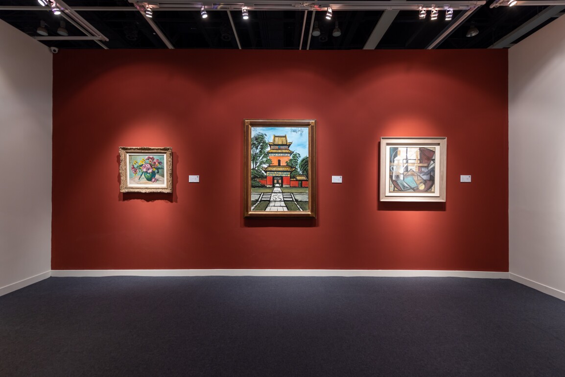
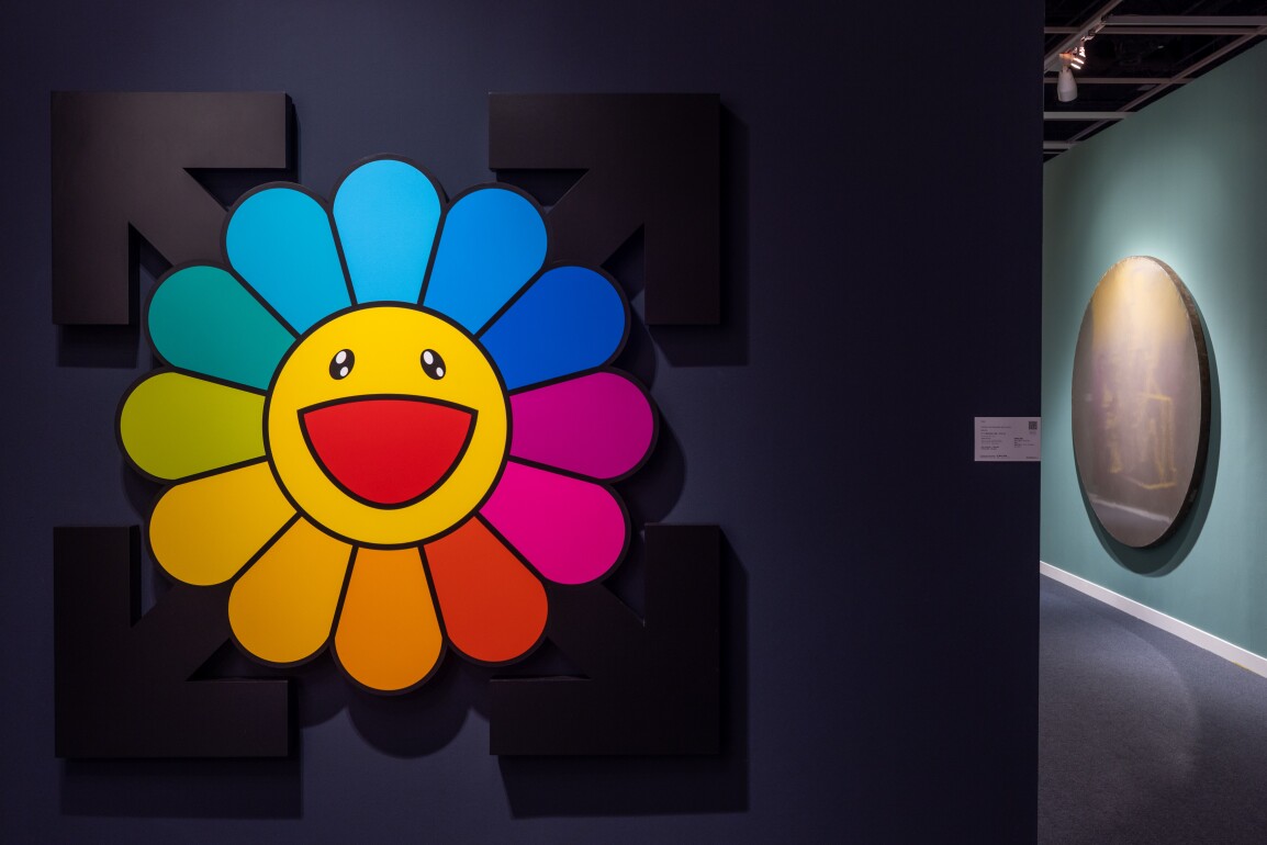
The durability of the white cube, the most radically pure of all curatorial designs, is undisputed, its echoes of the Bauhaus, its simplicity and seeming neutrality. However, what is neutral for some, may for others suggest clinical sterility, a cold, enforced solemnity, and an absence of soul. On the contrary, curators are increasingly favouring the choice of jewel reds and greens, soft hues of cream and grey, and assertive tones of yellows and blues to bring out the best of a painting and enhance the viewing experience.

As art critic Jonathan Jones commented in The Guardian in 2015: “Once, there was real shock in walking into a gallery as white and pure as a Stanley Kubrick space station. But times change. The new becomes old. White space galleries are now conventional and uninspiring places to show art.” Seven years later, the white cube’s position still seems unassailable but next time you view a work of art, take note of the wall colour, chances are, it’s not simply white.
This autumn, Sotheby’s Hong Kong invites you to curate highlight artworks online. Choose your favourites, pair it to a wall colour and experience the captivating power of colours.


