Jasper Johns’s 1973 screenprint Flags I features a richly colored and intricately layered surface of dripping marks that allude to the buildup of brushstrokes. Large in scale and technically complex, Flags I required 31 screens for its production. Sotheby’s upcoming Prints & Multiples auction (26–27 April, New York) presents the opportunity to acquire this work, the artist’s most famous print and an icon of contemporary printmaking.
The Flag:
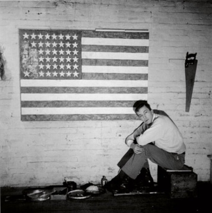
Johns’ first use of the flag motif was the result of a dream the artist had in 1954 when he was 24 years old. Flag was exhibited in Johns’ first one-man show at Leo Castelli’s gallery in 1958 and is now located at MoMA in New York. Since that time, Johns has created more than 100 flags in various media, in a variety of sizes, as a single flag or in multiples, and depicted it in black & white, greys, in oranges and greens and in the traditional red, white and blue.
“… the flag seems special. He returns to it again and again as a musician returns to a favourite theme or set of chords, a poet to a particular metre, or as Rembrandt did to his own ageing physiognomy.”1 – Anne Seymour
A notoriously enigmatic artist, Johns has remained tight-lipped regarding any possible socio-political associations with his repeated depictions of flags, making any such interpretation the responsibility of the viewer. While the United States flag is a powerfully loaded symbol in the collective American consciousness and around the world, Johns’ intentions in creating these works are non-symbolic. Instead, he is concerned with their formal stylistic structure, “Because what’s interesting to me is the fact that it isn’t designed, but taken. It’s not mine.”2 As something "the mind already knows," the motif of the flag provided Johns with a ready-made composition and allowed Johns to create meaning through other avenues, such as the physicality of his surfaces, in his process of making marks and in his choice of medium.
The painting of a flag is always about a flag, but it is no more about a flag than about a brushstroke, or about the physicality of paint.
The Painterly Screenprint:
Although Johns was initially wary about screenprinting, the early 1970s marked a period of increased use of the medium by the artist in collaboration with Simca Prints Artists, Inc. While the Pop artists of the 1960s heralded the medium for its commercial associations and ability to create hard-edged forms of flat color, the printers at Simca were known for more painterly screenprints that defied the mechanical quality that was associated with the medium. When asked about the uniquely complex and painterly surface of his screenprints, Johns responded:
“I think that might properly be considered an abuse of the medium (laughs)…What I do, what I tend to do, is to first work freely with the brush on the screens, getting whatever shapes the brush makes. Then I tend with additional screens to reinforce those shapes. And that confuses a little bit the flatness of it and suggests a different kind of activity. But it’s basically an illusion created by adding.”3

The Making of Flags I:
Thirty-one screens were employed in the production of Flags I, co-published by the artist and Simca in 1973. First, each flag was printed in a flat green, gray and orange to which more painterly marks of a darker green, gray and orange were then added. Next, the complementary colors of red, white and blue were added, covering the majority of the previous printing. Layers of different shades of red, white and blue were successively added and finally, a layer of varnish gloss was added to the flag at right.
Upon close inspection, the flag dissolves into a series of marks and colors. Bits of the earlier printings are revealed and the use of complementary hues creates the perception of a richer, deeper surface. The additional layer of varnish at right and the more saturated colors and densely drawn lines of the flag at left force a subtle shift in the viewer’s visual reading of the work.

The distinctions between right and left-hand flags mirror that of Two Flags, John's painting from the same year, on which Flags I was based. The same screens, with the exception of the varnish screen, were then used to create Flags II, shown above, printed this time in monochrome. Therefore we can compare not only the subtle differences between the left and right-hand flags, but also the subtleties revealed by the use of paint or ink and color versus shades of gray. Treating the same image in a variety of techniques has been a constant in Johns’ work. In the artist’s own words:
“I’m always interested in the physical form of whatever I’m doing and often repeat an image in another physical form just to see what happens, what the difference is. And to see what it is that connects them and what it is that separates them. Because the experience of one is rarely the experience of the other, for me at any rate.”4
1. Anne Seymour, Exh. Cat., London, Anthony D’Offay Gallery, Jasper Johns Flags, 1996, pp. 5-6
2. The Prints of Jasper Johns 1960 – 1993, A Catalogue Raisonné, introduction
3. ‘An Interview with Jasper Johns about Silkcreening’, Jasper Johns, Prints from the Leo Castelli Collection, 1991, p. 17
4. Ibid, p. 23


