How Marcel Breuer’s Archive Inspired the Graphic Design Details at Marcel
How Marcel Breuer’s Archive Inspired the Graphic Design Details at Marcel
By
Sarah Medford| May 26, 2026
Roman and Williams mined the architect’s personal papers to envision the menus, napkins, matchbooks and other ephemera at their new Sotheby’s restaurant.
Photography by Sean Thomas
Roman and Williams mined the architect’s personal papers to envision the menus, napkins, matchbooks and other ephemera at their new Sotheby’s restaurant.
Photography by Sean Thomas
A coatcheck ticket at Marcel, the restaurant at Sotheby’s Breuer building.
R
estaurants tucked inside museums and auction houses tend to be unassuming places, more about expediency than style. But Marcel, recently opened on the lower level of Sotheby’s Breuer building and spilling into its sculpture garden, aims to be something more. Precisely how much more comes into view when you make time for lunch at one of its tufted banquettes, maybe starting within the vodka-based “Brutal Martini” to smooth your way through the continental menu—the gratin de cabillaud sounds particularly good today.
Marcel is a collaboration between Sotheby’s and Roman and Williams, the design brand whose principals, Robin and Stephen Alesch, operate the restaurant and have overseen its creation down to your martini glass, handmade by Japanese artisan Naoya Arakawa, and the painterly matchbook covers. This is the couple’s second spot, a follow-up to La Mercerie, the French venue inside their Roman and Williams Guild home goods store on the southern edge of SoHo.
But it’s the first to invite comparison with a niche category of restaurants for which they have deep nostalgia—settings like the Four Seasons, Windows on the World and the Rainbow Room, which paired exceptional architecture with inventive food and theatrical flair to become part of New York’s story.
A Marcel cocktail napkin.
“That tradition has kind of been lost,” says Robin, sliding into a seat in the post-lunch dining room. “I hope that with the right intention, this place could one day have that kind of meaning for the city.”
From its inception, in early 2024, the restaurant’s design has been informed by Marcel Breuer’s monumental 1966 building. Stephen studied the architect’s original plans and made sense of certain landmark restrictions before programming the front of house into a dining area, bar, patisserie and 24-seat private dining room. Robin began learning about Breuer the man, looking for unexpected ways to bring him into the space. She points to a museum case near the bar, where a Goethite on pyrite (price on request) nods to Breuer’s love of geological forms, its crystalline structures echoing the trapezoid windows just a few floors above.
The restaurant’s stationery, with a mix of fonts inspired by Marcel Breuer’s business cards.
The research the designers embarked on wasn’t so different from what they did when they worked in film production or for their 2020 redesign of the British Galleries at the Metropolitan Museum of Art. In the Smithsonian archives, they found a jokey coloring book, likely made by Breuer’s office colleagues, with cartoons sending up his thick Hungarian accent and love of the finer things: cigars and martinis, oxfords and well-tailored suits. (He was partial to charcoal brown, a discovery that sent Robin into the stratosphere; the banquettes are now charcoal brown.) The Alesches also hired a fixer in southern Hungary, Breuer’s birthplace, to track down details of his childhood, including his favorite meal. Chef-partner Marie-Aude Rose’s version of chicken paprikash is an homage to Breuer’s mother’s recipe.
“He liked simplicity in life,” I.M. Pei said of his good friend and professional colleague, in 2002. “He remarked to me, jokingly, that he would like the life of a shepherd.” Breuer and Pei had vacationed together a few times in Greece, sailing around the islands with their wives. “Wherever we went, we drank a lot of ouzo, and he liked to observe people,” Pei went on. “Very simple people.” Around that time, news photographs captured Breuer at the construction site of the future Whitney Museum of American Art. He’s dressed in a dark suit and tie, his hair slicked back, and a smile is taking hold as he shows off the cantilevered building to Jacqueline Kennedy Onassis and her gravity-defying coif.
The more the Alesches learned about Breuer, the more they felt they needed to know. “We were thinking, well, he was a pretty emotional, warm and inviting guy—but also, look at all the things he made,” Robin says, glancing up at the brooding staircase and bush-hammered concrete walls. “That all fed into one heart, do you know what I mean?”
A matchbook with matches in Breuer blue.
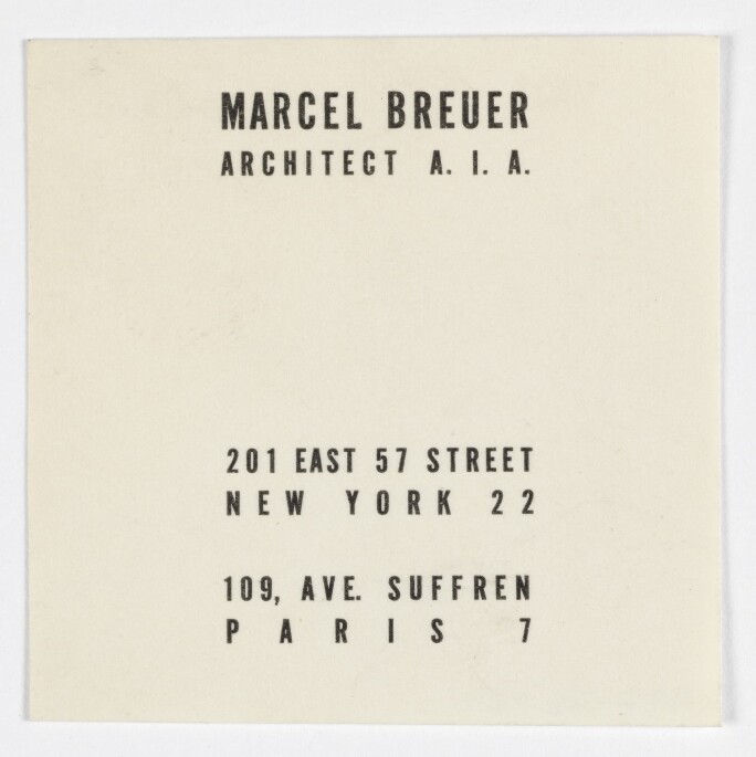
Of all the ephemera they sifted through, a cream-colored business card that Breuer had used to establish himself after moving from Budapest to London in the mid-1930s turned out to be the key. “Mr. Marcel Breuer, Architect,” it reads in a delicate cursive script, like something you’d find on a milliner’s card. Underneath, in a capital sans serif font, are his details: “4 Tregunter Road, London S.W.10, Flaxman 5322.”
“That business card just set my brain off,” Robin says. “It was a small but intensely impactful touchpoint—I don’t want to say undermining, but shaking up that extremely common idea that someone like Breuer, or someone from the Bauhaus, was so firmly placed in the modernist mindset, versus being extremely curious and interested in squeezing the lemon of what had come centuries before and what he could create for the future.”
The matchbooks at Marcel.
That tension became the motivating vision behind Marcel. On the restaurant floor, one side of the dining room is warm and tactile, with walnut paneling, while the side facing Madison Avenue is lighter and more austere, the result of landmark requirements and a move toward simplicity where the concrete walls intersect the windows. The friction-producing result echoes any number of contradictions inhabiting Breuer’s architecture: solid and void, repetition and singularity, nature and industry.
Suzanne Shaheen, co-founder of Look Studios, which collaborated on the restaurant’s branding, was taken with a phrase coined by architectural historian Barry Bergdoll to describe a central paradox in Breuer’s work: “heavy lightness.” “Rough and weighty materials used to convey lightness and levity,” Shaheen says. “We loved that. And we worked with that idea quite a bit in type.”
Marcel Breuer’s New York business card, circa 1956. Photo: Cooper Hewitt, Smithsonian Design Museum / Art Resource, NY.
G
raphically, the contrast was expressed as a conversation between two typefaces. Tiffany Gothic, an imposing semi-serif derived in 1901 from an engraver’s font typically used on metal, wood and other building materials, was paired with a font resembling Sackers Script Std Italian Script, which, Shaheen says, “felt more human, expressive, like a hand in motion. The semi-serif was balanced by the softer, gestural script—tough on the outside, warm and intimate on the inside, with a touch of femininity.” You can feel this back-and-forth on the menus and the restaurant’s card, as if they can’t decide which era they belong to.
For Robin, the duality becomes the point. “Breuer’s evolution was really part of the intellectual and aesthetic journey of the 20th century,” she says. “Stephen and I are compulsive about that modernist cusp.” So compulsive, in fact, that they couldn’t stop dredging up references: dadaist manifestos, surrealist exhibition posters, underground zines, examples of concrete poetry, with their walls of words—all contributing to the ontological paprikash bubbling on Marcel’s stove.
Shaheen says the new sources complicated the restaurant’s narrative in useful ways. “They layered into or pushed against Breuer’s playful approach—in menus and signage, for instance,” she explains. “The menu type isn’t perfectly kerned, placed or centered. This plays off the building—the way the windows, from the outside, look scattered across the facade. We were really interested in that. It’s so geometric, but irregular.”
O
ne of Robin’s favorite research rabbit holes involved the Belgian conceptual artist Marcel Broodthaers, whose “Moules” (“Mussels”/“Moulds”) series of sculpture and works on paper, created in the 1960s, yoked past and future through typography and poetic wordplay. In Broodthaers, she says, they encountered a modern artist “not divorcing himself from tradition or history, but pulling the two together.” The idea is essential to Roman and Williams’ work, she points out, but also to Breuer, Sotheby’s and to the building’s original occupant, the Whitney Museum, whose inaugural show was titled “Art of the United States: 1670-1966.”
Breuer’s circa 1936 business card.
For the past month, La Mercerie Pâtisserie at Marcel has been yoking past and future in an assortment of trapezoidal puff pastries and sky-blue madeleines, a color Breuer often used for accent walls and for the canvas covers on his 1925 “Wassily” chair. Putting that blue on a chair at Marcel would have been, Robin says, “too rinse-and-repeat for us.” But on a shell-shaped French butter cake with origins in the 18th century? “So punk and modern.”
The most coveted take-out item so far has been the German-made matchbooks, which feature an Ezra Stoller photograph of the building’s signature window encasing two rows of wooden matches. In a high-wire bit of merchandising, some of Sotheby’s upcoming trophy lots will get their own limited-run matchbooks when they go on display at Marcel in advance of key sales.
“Being surrounded by art of all periods and mediums truly enhances the dining experience at Marcel,” says Lisa Dennison, Sotheby’s chairman, Americas. “There will always be something new to discover.”