
Property from a Private Collector
Rameshwar Broota
Where to Go
Auction Closed
March 21, 06:10 PM GMT
Estimate
100,000 - 150,000 USD
Lot Details
Description
Property from a Private Collector
Rameshwar Broota
b. 1941
Where to Go
Oil on canvas
Bearing two labels on reverse:
1. 'Artist's name Rameshwar Broota / Address T/13 Rajouri Garden / New Delhi - 27 / Title "WHERE TO GO" 1967 / Price'
2. 'Name - RAMESHWAR BROOTA / Address - TRIVENI KALA SANGAM / 205- TANSEN MARG / NEW DELHI / Title - "WHERE TO GO"'
49 ¾ x 69 in. (126.3 x 175.2 cm.)
Painted in 1967
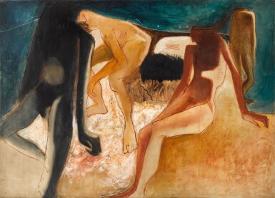
Painted in 1967, Where To Go is an archetypal example of a brief but lauded period of Rameshwar Broota’s career. Following his accomplished portrait work of the early and mid-1960s, Broota turned his attention to depicting the emaciated anatomies of Delhi’s laboring class. These powerful anatomical studies became probing explorations of the human condition.
‘...[Rameshwar Broota's] tall canvases [were] now filled with larger-than-life figures of laborers, minutely capturing the last surviving shreds of life existing in their weathered bodies and tense muscles. He was thus representing the neglected and marginalized with heroic dimensions, poetic justice if you like. Their elongated limbs and brooding postures, rendered Broota’s anguish and indignation in an expressive style. In their pictorial treatment, he thinned down the oil paint and its consistency to get a watercolor like effect, creating a transparency that made the painted bodies of the deprived lose their weight and fleshiness.'
(R. Karode, 'Visions of Inferiority: Interrogating the Male Body', Rameshwar Broota,: Interrogating the Male Body, Kiran Nadar Museum of Art, New Delhi, 2015, p. 24)
Responding to the extreme poverty which he witnessed around him, the artist was no longer ‘convinced of the expressive possibility of the face to concretely represent the presence of an inner character’. (ibid.) Indeed, in Broota’s works of the late-1960s, the faces of his subjects are largely obscured. Instead, the artist focuses on their starved and gaunt limbs and dejected postures.
In Where To Go, the warm ochre and umber tones of the foreground area and trio of figures on the right, strikingly contrast with the swathe of deep aquamarine at the top of the canvas. The two foreground protagonists are heavily shadowed, which serves to evoke the cavernous negative space created by their emaciated forms. The figure on the left, rendered in black, is an especially haunting figure in this powerful interpretation of the cruelty of humanity.
You May Also Like


